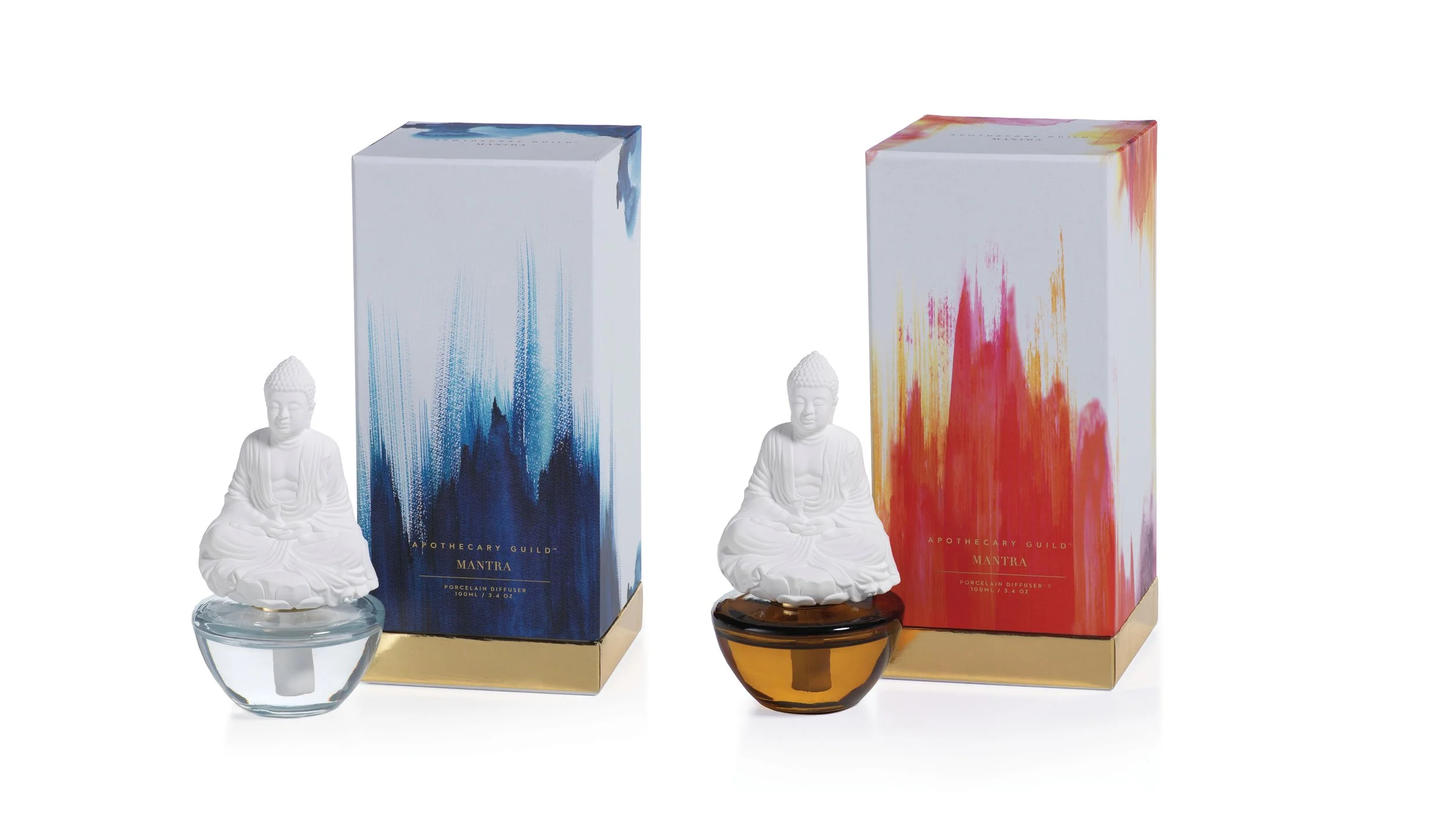
MANTRA
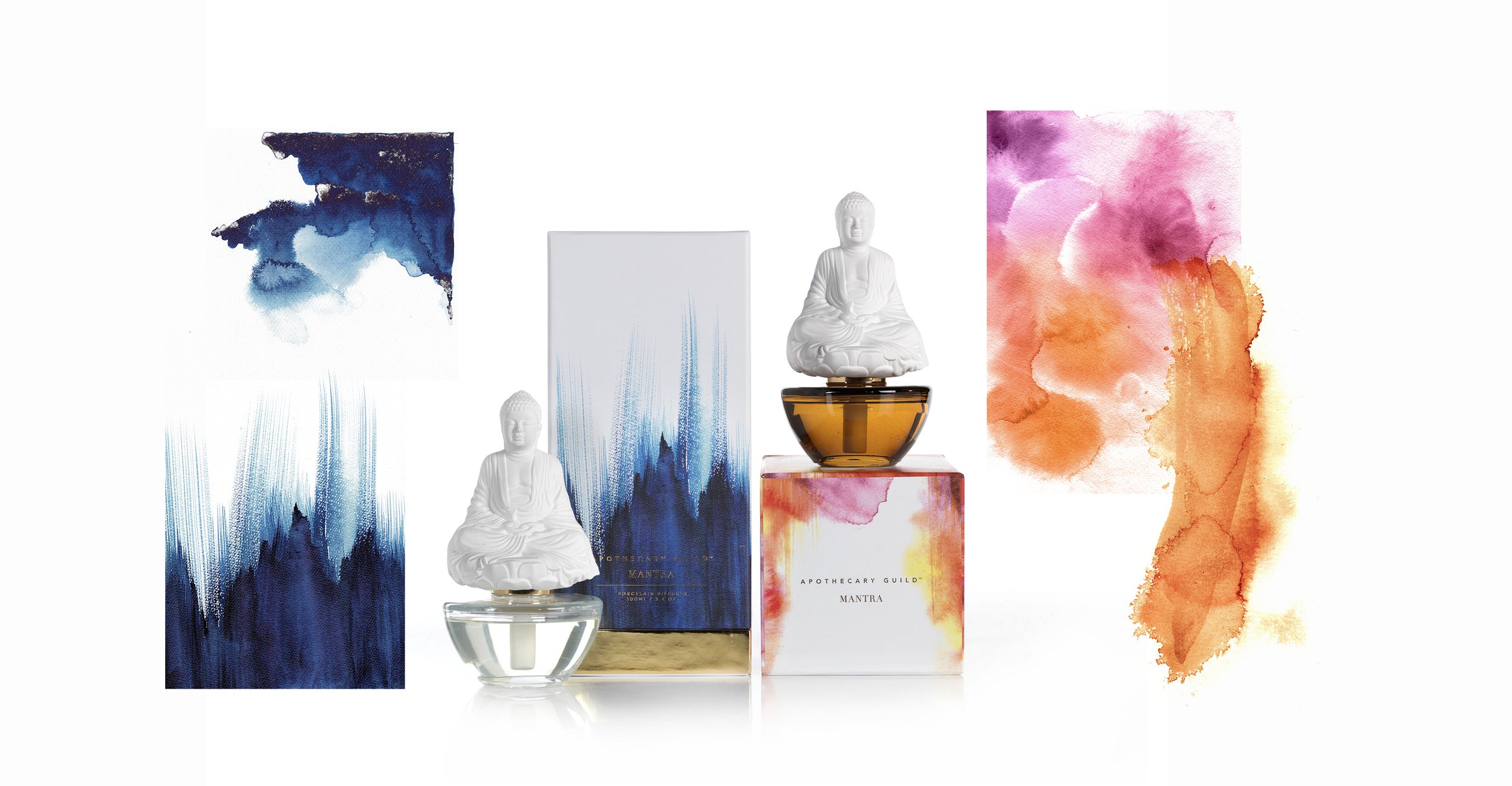
This packaging project balances cool and warm color palettes to create an elevated, elegant aesthetic. Gold accents paired with fluid brushstrokes and watercolor textures evoke a sense of calm, flow, and heightened mental clarity, aligning the design with a refined, wellness-focused brand identity.
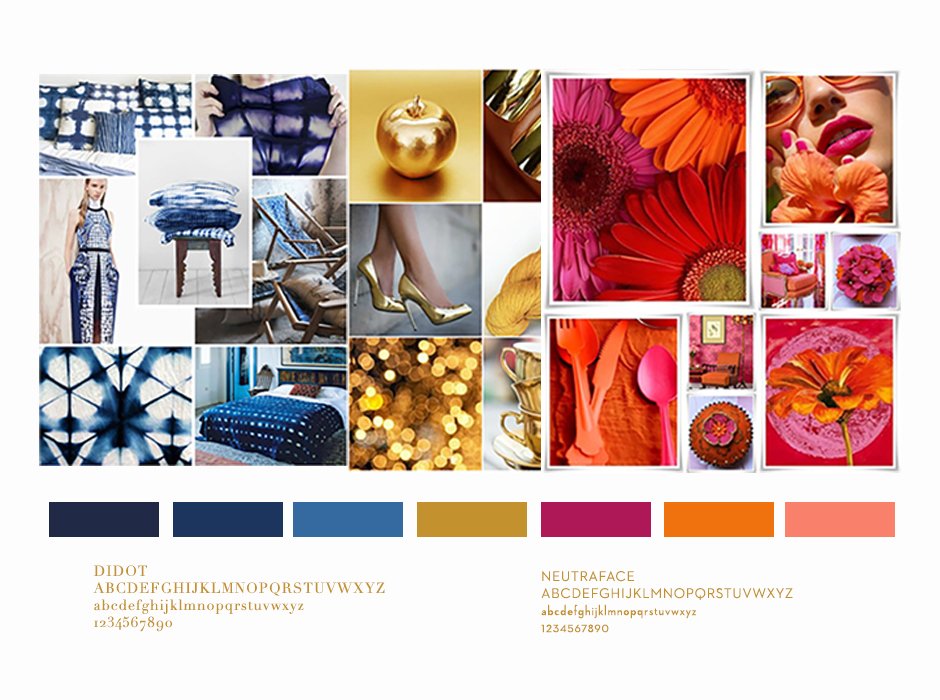
The color story for this project was inspired by a balance of cool and warm tones, anchored by gold accents. I was drawn to Japanese shibori prints for their effortless, bohemian quality—organic, fluid, and reminiscent of ocean movement. Gold adds warmth and refinement, while soft hues of pink, orange, and yellow introduce a sunlit warmth, creating an inviting and elevated visual experience.
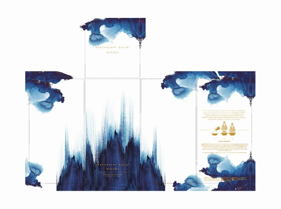
In collaboration with overseas manufacturers, various porcelain diffuser forms were explored before selecting the Buddha, paired with a tall, vertical box to convey elevation and quiet movement. Printed on canvas and finished with deliberate brushwork and gold foil accents, the packaging merges modern craftsmanship with refined production, resulting in a composed, premium presentation.